Mobile SEO Guide 2026 – Mobile-Friendly Ranking
Can a single change to your site lift its rank in search results and boost user trust on phones?
I write this guide to set clear expectations: I focus on fundamentals that help my site appear and perform better in mobile search results. I explain why Google’s mobile-first indexing means the phone view is what matters most for ranking.
I cover key page elements: performance, accessibility, structured content, and UX so users can find information fast on small screens. I prefer responsive design because it keeps one URL and the same HTML for both desktop and phone, which cuts redirects and speeds up load times.
My practical angle uses PageSpeed Insights, Lighthouse, WebPageTest, Google Search Console, and GA4 to audit and fix issues. The payoff is clear: faster pages, higher engagement, and stronger click-through rates that grow visibility for my website and pages in 2026.
What I Mean by Mobile SEO in 2026
In 2026 I tune my pages to fit phone browsing habits so users find information fast and stay engaged. I define mobile seo as aligning my site, content, and technical stack to how people search and consume information on handheld screens.
Mobile-first indexing means Google evaluates the mobile version when determining rankings, so changes I make for phones affect results across all devices. Over half of global traffic comes from mobile devices, which makes mobile seo important for reaching audiences where they browse most.
- I adapt content into concise sections, clear headers, and scannable elements to reduce cognitive load.
- I prioritise fast interaction, readable typography, and tap-friendly controls to lower friction to conversion.
- I bias optimisation toward reliability on mid-tier devices and average connections common across India.
| Priority | Desktop | Phone-focused |
|---|---|---|
| Layout | Wide, multi-column | Single column, clear CTAs |
| Performance | High bandwidth assumptions | Optimised for moderate networks |
| Measurement | Session duration, conversions | Search visibility, engagement, conversion rate |
Why Mobile-Friendly Ranking Matters Now
Search has moved. I now build and test pages knowing the on-device view is what search engines evaluate first.

Mobile-first indexing and what it means for my site
Mobile-first indexing means Google ranks pages using the mobile version, so if my site omits content on that view, those sections don’t help me rank.
I confirm the same primary content, internal links, and structured data appear on both views. If they differ, visibility drops even for desktop queries.
Mobile usage trends and their impact on search results
Current data shows roughly 58–62% of web traffic comes from mobile devices, and about 90% of shoppers use a phone in-store for product research. This shifts where I focus improvements.
More searches, sessions, and conversions now originate on hand-held screens. Rich results and verticals (local, products, FAQs) dominate these results, leaving less room for standard listings.
- Revenue: faster, usable pages reduce pogo-sticking and lift conversions for local and time-sensitive queries.
- Risk: blocked resources, slow pages, or missing sections on the phone view hurt rankings across desktop and device types.
- Practical check: I use field data and console reports to verify parity and to optimise for variable networks common in India.
How I Assess My Current Mobile Experience
I begin with data: lab and field tests that show where users slow down or drop off. I measure representative pages across my site and capture baseline metrics before any fixes.
Using PageSpeed Insights, Lighthouse, and WebPageTest
I run PageSpeed Insights to record Core Web Vitals for each page and get clear recommendations. Lighthouse gives audits for performance, accessibility, and seo-related checks I can action quickly.
| Tool | Primary output | When I use it |
|---|---|---|
| PageSpeed Insights | Field vitals & suggestions | Quick baseline per page |
| Lighthouse | Lab audits (accessibility, perf) | Prioritise developer fixes |
| WebPageTest | Waterfalls & filmstrips | Deep render and main-thread analysis |
What I check in Google Search Console and GA4
I open Search Console to spot indexing coverage and mobile usability issues, and to confirm critical JS/CSS/images are not blocked on the mobile site.
- I create GA4 comparisons by device category to spot drop-offs and different behaviour from users.
- I validate canonical content and internal links match across views, then document issues for dev and design.
- I capture before/after data snapshots to prove impact on engagement and conversions.
Choosing the Right Mobile Configuration
I pick a configuration that keeps content consistent and reduces maintenance overhead. A clear choice here saves time for engineering and prevents user-facing problems on small screens.

Why I recommend responsive design for a single URL and HTML
I choose responsive design so my site serves the same URL and HTML to every visitor. CSS adapts layout while the core content and links stay identical across desktop and phone views.
This approach cuts redirects, avoids duplicate content, and makes the website easier to share and crawl. It also conserves crawl budget because search agents fetch each page once, not per version.
When dynamic serving or separate URLs cause issues
Dynamic serving can fail if device detection is wrong. That may deliver a desktop experience to a handheld device and harm engagement.
Separate URLs like an “m.” site add canonical and alternate linking. Misconfigurations create duplicate content and increase maintenance risk.
- I keep one URL and one HTML version to simplify crawling and reduce errors.
- Responsive CSS preserves parity between desktop and other versions without swapping content.
- Dynamic serving or separate URLs are rare choices and need strict guardrails and testing.
- I work with engineering to validate breakpoints and confirm images, links, and components behave the same.
| Config | Pros | Cons |
|---|---|---|
| Responsive | One url, one HTML; simple to maintain | Requires careful CSS across breakpoints |
| Dynamic serving | Tailored markup per device | Risky detection; wrong version delivery |
| Separate URLs | Custom experience per site version | Extra links, canonical tags, higher errors |
Ensuring Crawlability and Content Parity on Mobile
I start by ensuring the site serves the same content and assets that a real device would see. Google needs access to JS, CSS, and images to render pages correctly. If those resources are blocked, the rendered result can differ from the desktop version and important content may be ignored by mobile-first indexing.
Letting Googlebot access JS, CSS, images, and data
I verify robots.txt and server rules don’t block scripts, styles, or images. I use Search Console’s blocked resources report to spot constraints and to fix them quickly.
Keeping mobile and desktop content, links, and metadata aligned
I compare the desktop version and the phone view of key pages to confirm identical primary content, internal links, and structured data. I check canonical tags, hreflang where used, and metadata so they match across versions.
- I render templates with a mobile user agent to see what google search and crawlers encounter.
- I document content behind tabs or accordions and keep critical information visible for evaluation.
- I test on a real device to validate rendering beyond lab tools and to catch edge-case issues.
Performance First: Core Web Vitals and INP on Mobile
Fast, responsive interactions win attention on small screens and decide whether visitors stay or leave.

I track three field metrics: Largest Contentful Paint (LCP), Cumulative Layout Shift (CLS), and Interaction to Next Paint (INP). INP replaced FID in 2024; under 200 ms is good, 200–500 ms needs work, and above 500 ms is poor.
LCP, CLS, and Interaction benchmarks
I aim for LCP under 2.5 seconds and CLS below 0.1 while keeping INP under 200 ms. These targets help the page feel fast and stable to users on a range of devices common in India.
Fixing long tasks, large DOMs, and event handlers
- I break long JavaScript tasks with code-splitting and task scheduling to reduce main-thread blocking.
- I trim DOM size by simplifying templates and removing unnecessary wrappers that cause extra layout work.
- I optimize event handlers to avoid heavy computation or synchronous network calls on taps.
- I prioritise image optimisation and critical CSS so hero elements render quickly and don’t shift.
Real-world vs. lab data I monitor
I compare CrUX and PageSpeed Insights field data with Lighthouse lab runs to align fixes with real users. I use WebPageTest to inspect waterfalls and spot render-blocking requests over time.
| Metric | Good | Tool |
|---|---|---|
| LCP | <2.5s | PageSpeed Insights / WebPageTest |
| CLS | <0.1 | Lighthouse / Field Data |
| INP | <200ms | CrUX / Lab Reports |
UX Essentials: Viewport, Tap Targets, and Pop-Ups
A simple viewport and well-sized controls keep visitors focused on the content they came for.
Configuring the viewport meta tag correctly
I include the viewport meta tag set to width=device-width, initial-scale=1 so text scales and pages avoid horizontal scrolling.
This single line prevents tiny text and ensures my page layout matches the device width used by users.
Designing touch-friendly buttons and links
I size tap targets at about 48×48 px and add spacing between controls. Lighthouse will flag small or overlapping targets.
Clear controls reduce accidental taps and make forms and menus easier to use on the site.
Avoiding intrusive interstitials that hurt rankings
I audit pop-ups and remove entry interstitials that cover main content. Cookie notices and legal gates stay but as modest, dismissible overlays.
I test forms for the right keyboard types, autofill hints, and forgiving error messages to keep users moving forward.
- I use high-contrast type and proper line-height for legibility.
- I streamline design elements to reduce clutter and focus attention.
- I validate color contrast and focus states to aid accessibility and improve seo outcomes.
- I run Lighthouse checks and keep a deployment checklist to prevent UX regressions.
| Element | Best practice | Why it matters |
|---|---|---|
| Viewport | width=device-width, initial-scale=1 | Prevents tiny text and side scroll |
| Tap targets | ~48×48 px with spacing | Fewer accidental taps, better interaction |
| Interstitals | Dismissible or user-triggered | Avoids ranking penalties and drop-offs |
Writing and Structuring Content for Small Screens
On small screens, clarity wins: concise blocks and clear headings guide readers fast.
I keep paragraphs short so a reader can scan without fatigue. Each paragraph has one idea and one call to action when needed.

Short paragraphs, scannable headers, and white space
I front-load value in headings so pages show purpose at a glance. Headers act as micro-summaries for a quick skim.
I use white space to separate sections and controls. That spacing improves touch accuracy and makes the site feel less crowded.
Media choices: HTML5 video, tables, and lists for readability
I prefer HTML5 for video to avoid legacy plugins. I compress media and deliver captions or transcripts to help accessibility and seo signals.
- I use lists for step-by-step actions and brief comparisons.
- I include clean tables for dense facts so a user can scan without zooming.
- I optimise images and defer nonessential media to speed rendering on typical devices in India.
| Use case | Best choice | Why it helps |
|---|---|---|
| Quick facts | Bullet list | Easy to scan and read on small pages |
| Comparisons | Compact table | Shows contrasts without extra scrolling |
| How-to or demos | HTML5 video + captions | Clear visual steps with accessible text alternatives |
I avoid long walls of text and keep a consistent content design system across templates. These best practices help my pages load faster and improve user satisfaction.
Optimizing Titles and Descriptions for Mobile SERPs
A clear title and a tight description decide whether a searcher taps or scrolls past your page. I focus on concise, front-loaded headings that state the main benefit right away.
Title length, front-loaded value, and primary keyword usage
I keep title tags near 50–60 characters to avoid rewrites and truncation. I place the most critical term at the start so it remains visible on narrower screens.
Meta descriptions under mobile truncation limits
I write meta descriptions under about 105 characters to reduce truncation. Each description briefly summarizes value and ends with a clear call to action.
- I align titles and descriptions with the page content to set correct expectations and improve CTR.
- I avoid keyword stuffing and use one primary keyword naturally in the title.
- I A/B test messaging themes and monitor CTR and rankings to refine what works for my site and users.
- I apply these best practices consistently across templates to keep brand voice steady.
| Element | Target | Why it matters |
|---|---|---|
| Title | 50–60 characters | Prevents truncation in search results |
| Meta description | ~105 characters | Summarises value and boosts clicks |
| Alignment | Match page content | Delivers expected results and reduces bounce |
Structured Data That Elevates Mobile Visibility
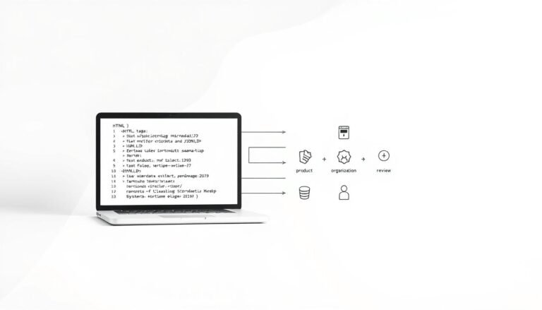
Proper schema lets my site speak in a language search engines and AI agents understand. I use JSON-LD so structured data about articles, products, how-tos, and FAQs is easy to parse.
How I use JSON-LD for Article, HowTo, FAQ, Product, and Local
I implement JSON-LD on core content types so pages can qualify for rich enhancements. For Article and HowTo, I surface publish dates, steps, and author fields. For FAQ, I expose Q&A pairs so answers may show directly in results.
Product markup includes price, availability, and ratings. LocalBusiness schema lists address, hours, and contact to boost nearby visibility on phones.
Rich results and their impact on CTR in mobile search
Rich results take up limited screen space and can improve click-through rates. I test markup with Google’s testing tools and track impressions and CTR for marked pages.
- I ensure schema matches on-page content and is error-free to keep eligibility.
- I update JSON-LD when my content or offerings change so the data stays current.
- I follow Google’s guidelines and avoid misleading markup or spammy practices.
| Schema type | Key fields | Why I add it |
|---|---|---|
| Article / HowTo | headline, author, steps, date | Increases chance for rich snippets and LLM citations |
| FAQ | mainEntity (Q&A) | Shows answers in SERPs without extra taps |
| Product / LocalBusiness | price, availability, address, hours | Surfaces shopping and local info immediately |
I treat structured markup as a living asset. Regular checks, testing, and alignment with best practices keep my site visible and useful to users in India and beyond.
Image Optimization for Speed and Quality
Serving the right image at the right size is one of the fastest wins for page performance. I focus on delivery choices that cut bytes and reduce time to meaningful content for users across India.
I implement responsive images with srcset and sizes so each device gets an appropriate file. I enable native lazy loading to defer offscreen assets and speed first render. I convert assets to WebP or AVIF where supported to shrink file sizes without visible quality loss.
- I list key images in an image sitemap to help discovery and indexing.
- I use a CDN to deliver assets closer to users and stabilise load time across regions.
- I compress files, set long caching headers, and include width/height to prevent layout shifts and improve CLS.
- I monitor LCP elements in PageSpeed Insights to validate that optimizations actually improved the metric.
| Technique | Benefit | Impact on metrics |
|---|---|---|
| Responsive (srcset/sizes) | Less wasted bandwidth | Lower LCP, smaller payloads |
| Next‑gen formats | Smaller files, same quality | Faster decode, reduced time |
| CDN + compression | Lower latency, repeat visits faster | Improved repeat load times and stability |
mobile seo for Voice Search and AI Overviews
When people speak to assistants, they expect quick, direct answers—so I design pages for extraction. Voice queries are conversational and often question-based, so I map long-tail intents into clear, linkable content snippets.
Conversational keywords and NLP clarity
I target question-style phrases and place concise answers at the top of each page. That makes it easier for natural language processors to pull a single helpful sentence.
- I use FAQ and HowTo schema to mark Q&A and step lists for clarity.
- I keep answers factual, short, and up to date so assistants can cite my content reliably.
- I monitor which phrases trigger AI overviews and refine wording and supporting data.
Staying visible in AI-generated results on phones
AI Overviews often claim prime screen space in mobile search. I build topical authority and earn mentions on reputable sites to raise my chances of citation by a search engine or assistant.
| Focus | Why it helps | Metric |
|---|---|---|
| Direct answers | Extraction ready | Impressions |
| Schema | NLP clarity | Rich result hits |
| Fresh data | Trust signals | Citation rate |
Measuring Results and Outpacing Competitors
I track how users behave by device to prioritise fixes that improve real-world engagement. My approach ties ranking signals to on-site metrics so I can prove impact and steer resources where they matter most.
Tracking rankings, CTR, and device splits
I set up rank tracking focused on phones to capture true positions and volatility. In Search Console I compare CTR by device category to spot titles and descriptions that underperform for handheld users.
In GA4 I review device-category reports and channels to see where users drop off. That tells me whether a page needs performance, content, or UX fixes.
Finding gaps and prioritising actions
I run keyword gap audits to find terms competitors rank for on phones that my site misses. I compare desktop mobile vs mobile desktop deltas to uncover presentation and intent mismatches.
- Prioritise fixes by expected impact: Core Web Vitals, content gaps, UX bottlenecks.
- Use a competitive dashboard tool and internal benchmarks to quantify gains.
- Align stakeholders to goals tied to site growth, revenue, and share-of-voice.
| Focus | What I measure | Action |
|---|---|---|
| Rankings | Device-specific positions | Adjust content & monitoring |
| CTR | Search Console device split | Rewrite titles/descriptions |
| Engagement | GA4 sessions & drop-off | Fix UX or perf issues |
Conclusion
I wrap this guide with clear actions that move my site toward faster, fairer rankings and happier visitors. Mobile-first indexing is universal and responsive design remains the recommended configuration.
I emphasise Core Web Vitals—INP now replaces FID—and the need to make sure JS, CSS, and images are crawlable so mobile and desktop content match. I also note title and description length, structured data, image optimisation, and avoiding intrusive interstitials as core best practices for better search results.
I commit to continuous measurement and iteration so my website stays fast and readable. A strong user experience aligns technical work with business growth in 2026 and beyond.


